INDUSTRY:
marketplace platform
YEAR:
2021
Role
UI/UX Designer

Overview
WII EAT is a food delivery app designed to give hungry users seamless access to multiple restaurants through a single, unified mobile platform. The app allows users to browse menus, compare prices and ratings, place orders, track deliveries in real time, and submit feedback all within a clean, modern interface built for any age group.
As one of two UI/UX designers on the project, I contributed to research, system design mapping, prototyping, and the delivery of the final high-fidelity user interface. The project challenged me to balance business viability, user delight, and technical feasibility in a highly competitive market.
Problem Statement
The Challenge
The food delivery market has grown rapidly, but many apps fail users in two critical ways: they overwhelm users with choices and cluttered interfaces, or they create friction at the moments that matter most ; searching, ordering, and tracking. The result is cart abandonment, frustration, and lost revenue.
WII EAT was conceived to answer a deceptively simple question: what does a food delivery app look like if you design it around the user's emotional state. lazy, hungry, time-pressured, and indecisive , rather than around business catalogues?
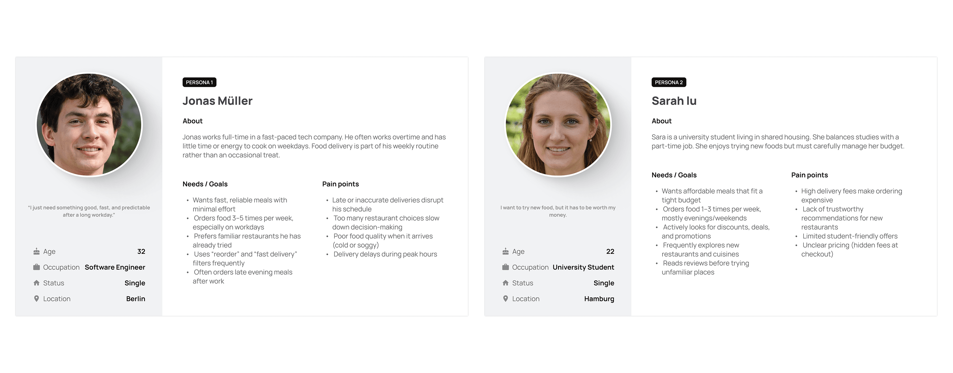
Target Users
• Urban professionals aged 22–40 who order food 3–5 times per week and value speed and reliability
• Families and group orderers who need to coordinate multiple preferences in one transaction
• First-time delivery app users who may be overwhelmed by complex interfaces
• Users who are unsure what they want and need contextual discovery support
Goals & Success Metrics
• Zero dead-ends — every user state (confused, browsing, ready to order) has a clear next action
• Accessible to all ages — no UX pattern should require prior app literacy
• Emotional design that matches the user's context (delight during browse, calm during wait)
• Reduce cognitive load at the menu and checkout stages
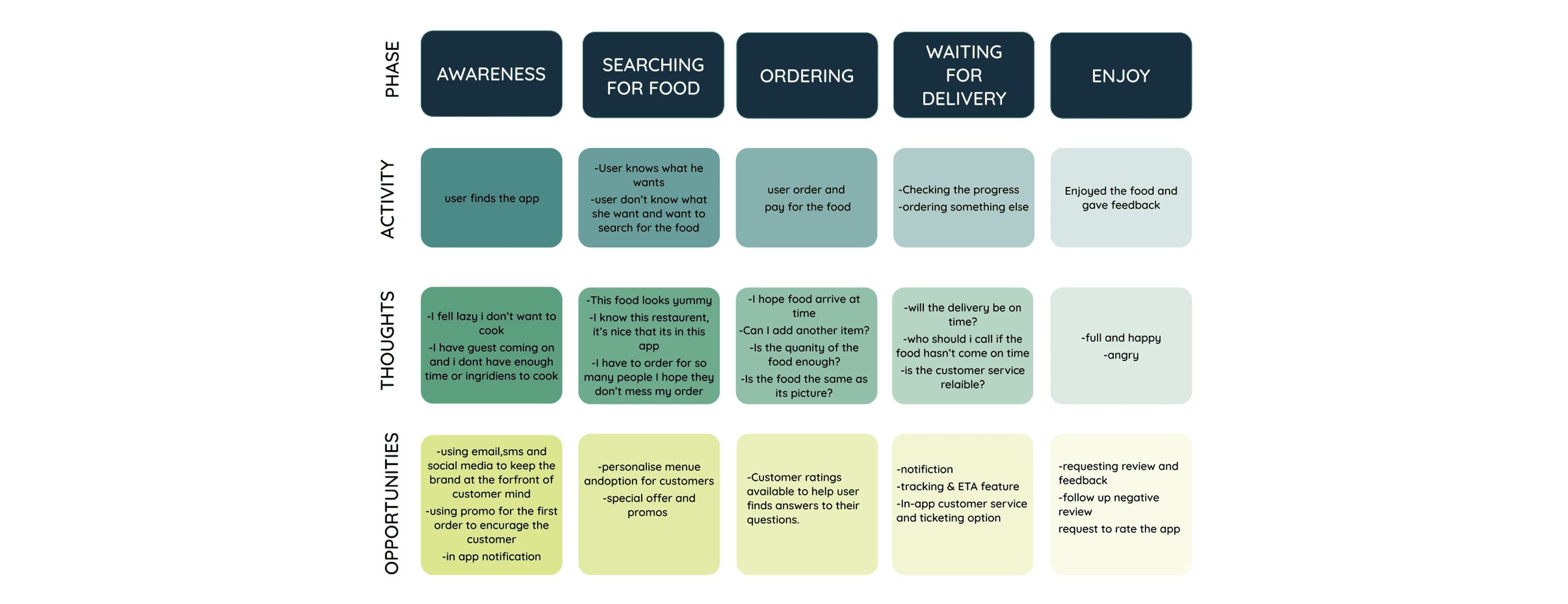
Research & Insights
Research Approach
The research phase combined competitive analysis, heuristic evaluation of existing apps, persona development informed by public industry data on food delivery behaviour. We also conducted informal user interviews with 8 participants across different age groups to validate key assumptions.
Competitive Analysis
I audited four leading delivery apps. Uber Eats, Deliveroo, Glovo, and Bolt Food and evaluated them across five dimensions: onboarding friction, search and discovery, menu clarity, checkout experience, and post-order transparency. Key weaknesses I identified:
• Most apps default to algorithm-driven 'Recommended' feeds with no explanation, eroding user trust
• Checkout flows average 5–7 steps; WII EAT targets 3 steps maximum
• Delivery tracking is often a separate screen with limited contextual communication
• None of the audited apps provided meaningful in-app customer support during the wait phase
Key Insights That Shaped Design Decisions
Design Process
Phase 1 — Research & Understanding
The process began with a thorough analysis of the competitive landscape, UX trends in the food delivery space, and platform guidelines for iOS and Android. I created three user personas representing the key archetypes: the Habitual Orderer, the Indecisive Browser, and the Group Orderer. These personas anchored all subsequent design decisions.
Phase 2 — Ideation & Sketching
Following the research phase, I moved to pen-and-paper sketching, a deliberate choice to separate creative thinking from tool constraints. I sketched 30+ screen states across the core user flows before settling on a structure. Key early decisions made during this phase:
• Bottom navigation with 5 primary destinations: Home, Categories, Near Me, Search, and Saved
• A persistent cart icon accessible from any screen to reduce checkout friction
• A card-based restaurant layout to allow easy side-by-side comparison
• A step-by-step order progress bar visible throughout the delivery wait phase
Phase 3 — User Flow & Information Architecture
I mapped a comprehensive user flow covering all primary and edge-case journeys:
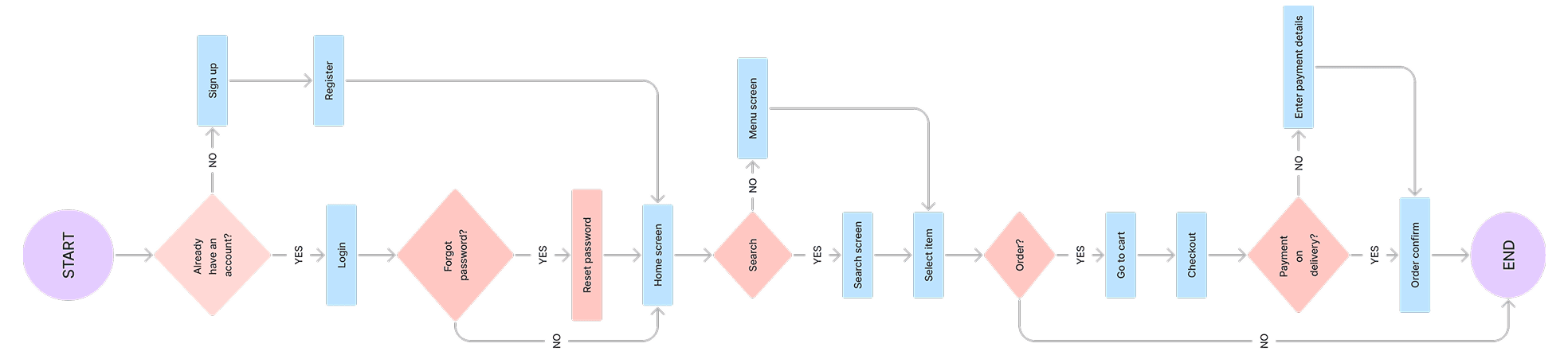
The flow was validated against the persona journeys to ensure every user state had a clear, intentional path.
Phase 4 — Low-Fidelity Wireframes
With the flow established, I built low-fidelity wireframes in Figma focusing on layout structure, component hierarchy, and interaction patterns. No colour or imagery was used at this stage — the goal was to stress-test usability purely through layout. I ran three rounds of informal feedback sessions during this phase, resulting in significant changes to the home screen hierarchy and the cart/checkout flow.
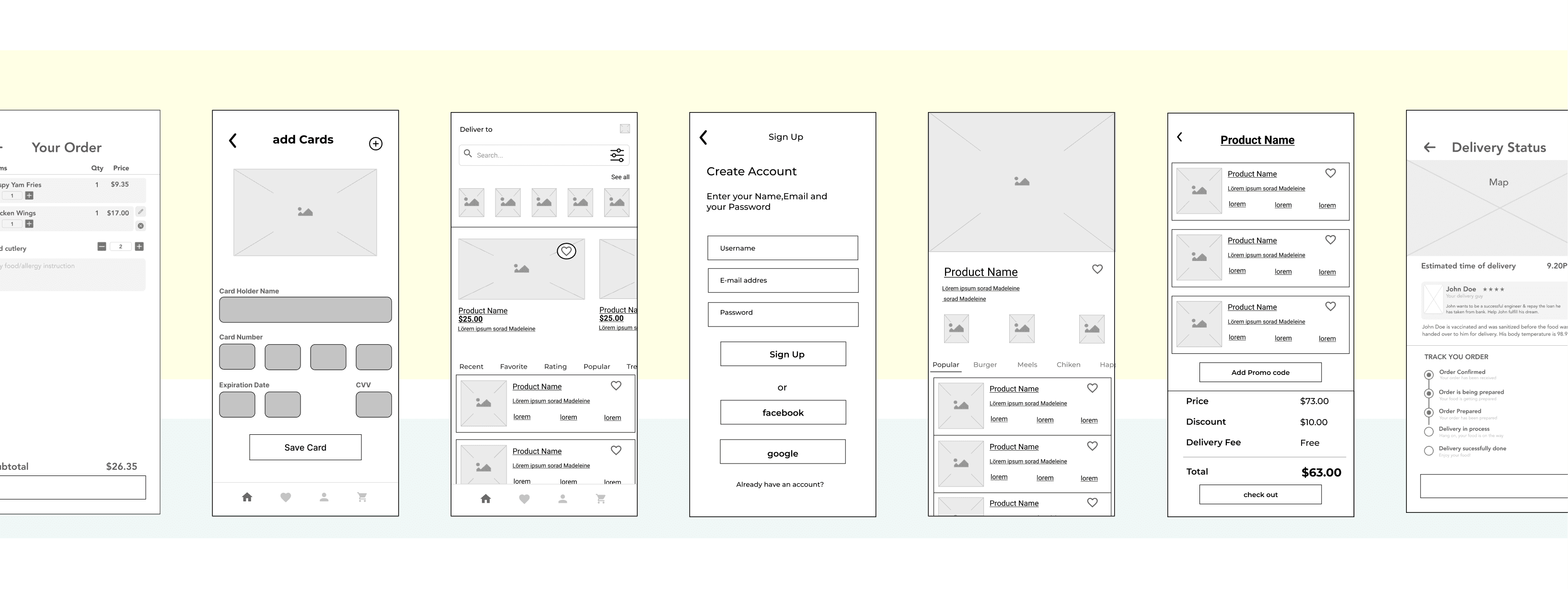
Phase 5 — High-Fidelity UI & Prototyping
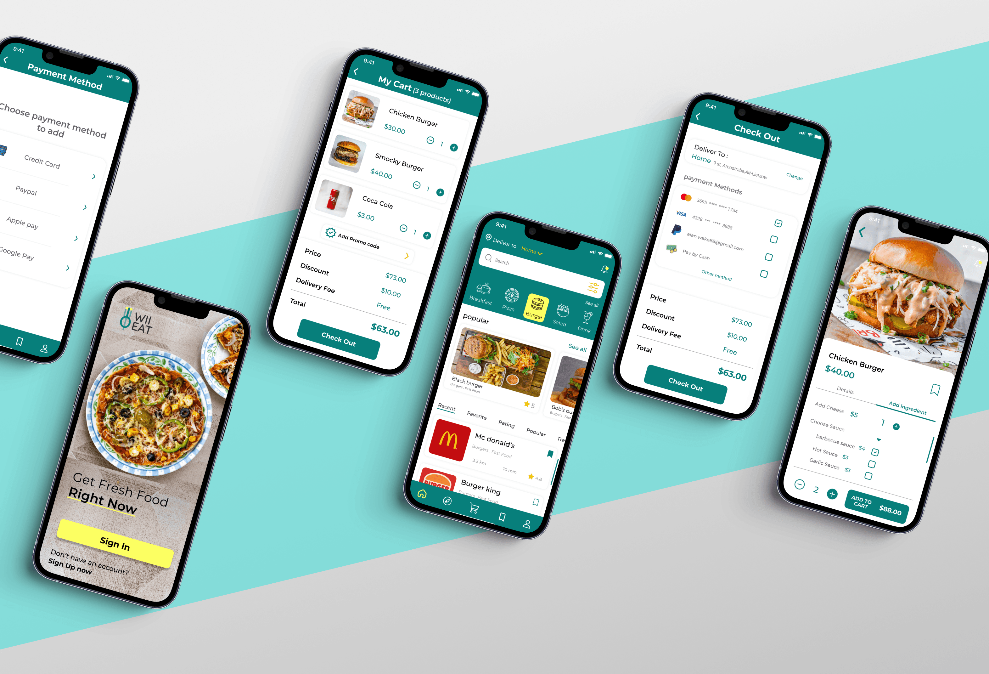
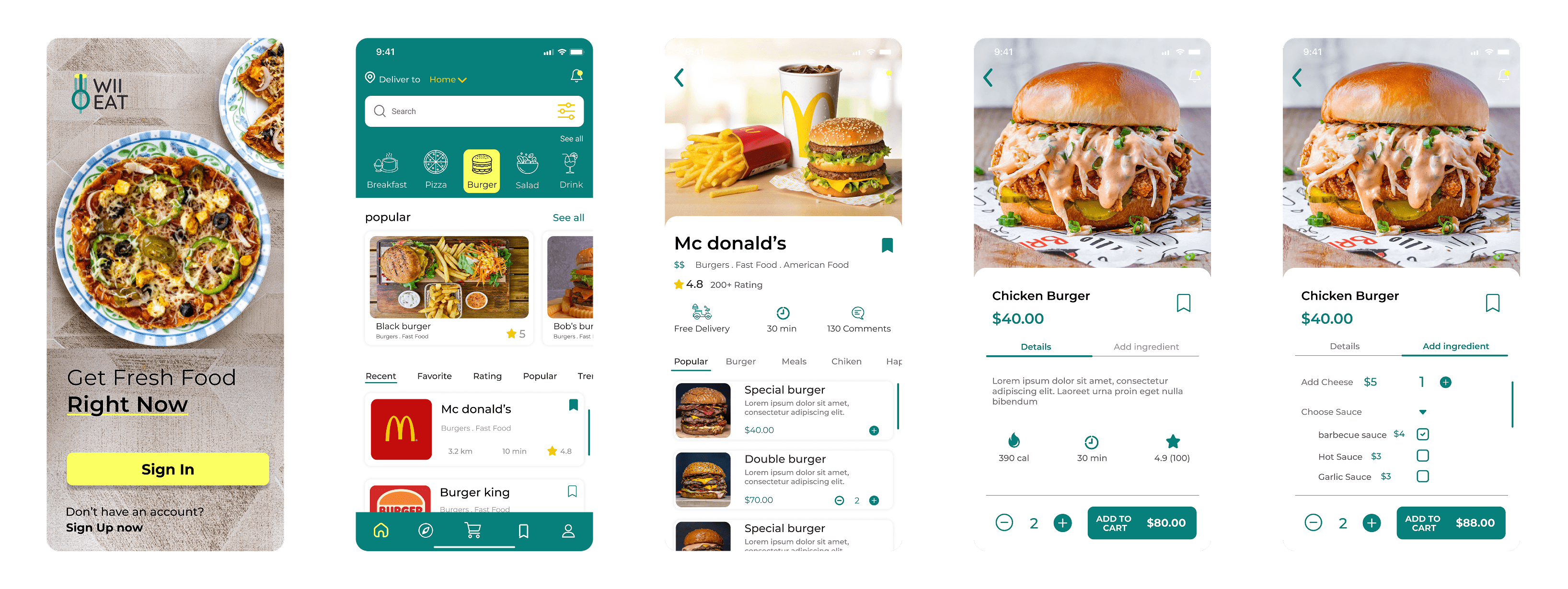
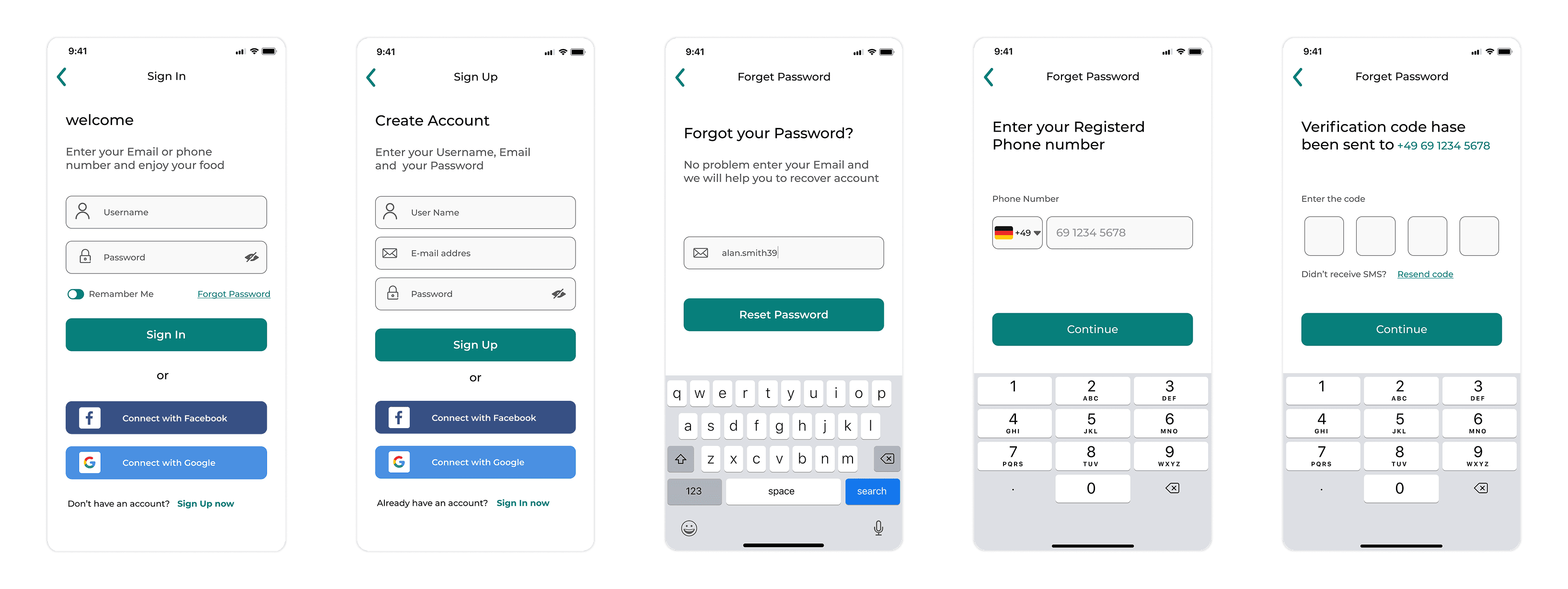
The final design phase produced a complete set of high-fidelity screens across six functional areas: Welcome & Main Page, Registration, Restaurant Page, Payment & Card, Delivery Tracking, and supplementary pages (profile, orders, saved, settings). An interactive prototype was built in Figma and used for final usability validation.
Key Features & Design Decisions
Dual-Mode Home Screen
Problem: Users arrive in two completely different states of mind — knowing what they want, or having no idea. A single-mode home screen fails half your users.
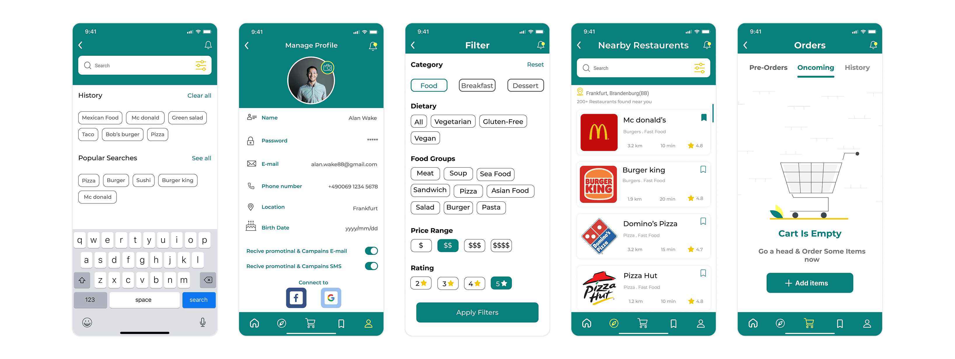
Solution: The home screen opens with a prominent search bar for decisive users and a visual category grid (Pizza, Burgers, Sushi, Healthy, etc.) for exploratory users. A 'Near Me' quick filter and a trending carousel provide additional discovery paths without overwhelming the interface.
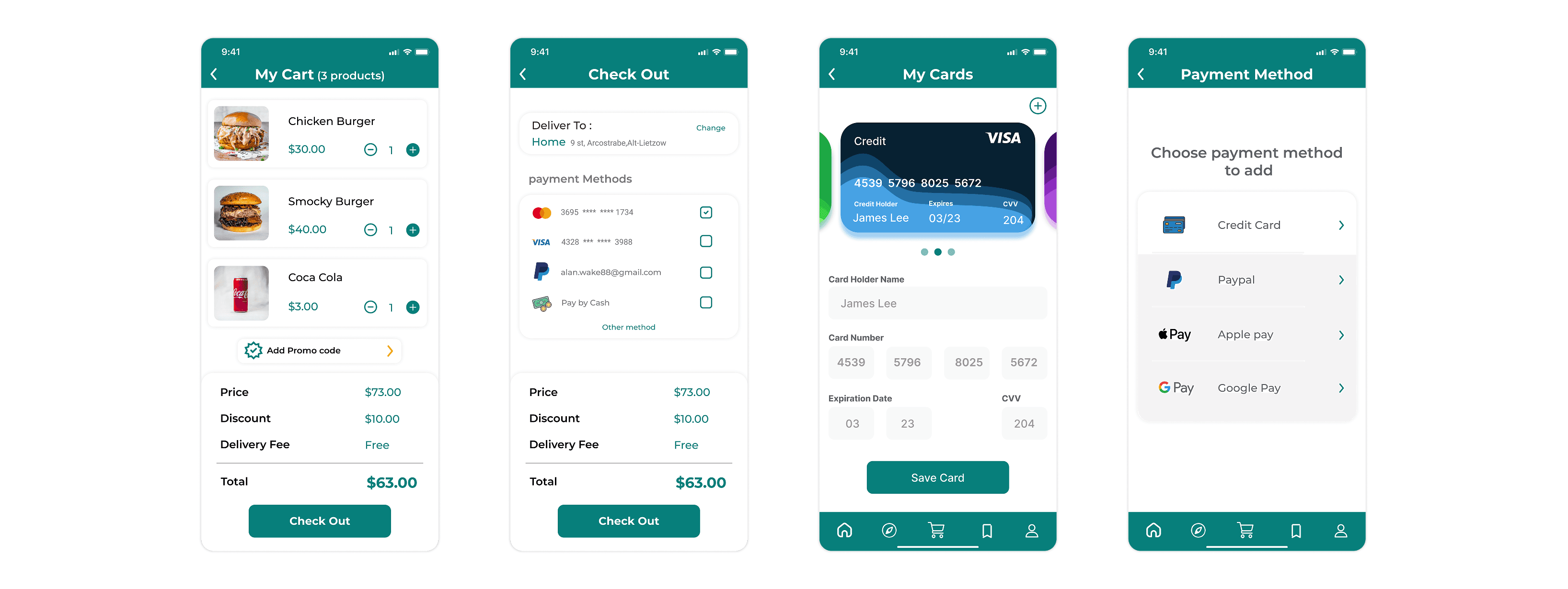
Streamlined 3-Step Checkout
Problem: Checkout abandonment is the most costly UX failure in e-commerce. Long, multi-screen flows compound this.
Solution: I reduced checkout to three steps: Cart Review, Delivery Details & Promo Code, Payment Confirmation. with saved address and payment method defaults pre-populated for returning users. The order summary is always visible in a sticky footer.
Live Delivery Tracking with Contextual Communication
Problem: The post-order waiting phase is a black box in most apps, creating anxiety and increasing support contact rates.
Solution: A dedicated tracking screen features a live map, a step-by-step status indicator (Order Confirmed → Preparing → On Its Way → Delivered), a real-time ETA countdown, and a direct in-app customer service access button. Push notifications update users at each status transition.
Personalised Profile & Order History
Problem: Users who can reorder in seconds and who feel the app 'knows them' are significantly more likely to return.
Solution: The profile section stores saved addresses, preferred payment methods, and a full order history with one-tap reorder. A Saved tab on the main navigation lets users bookmark favourite restaurants.
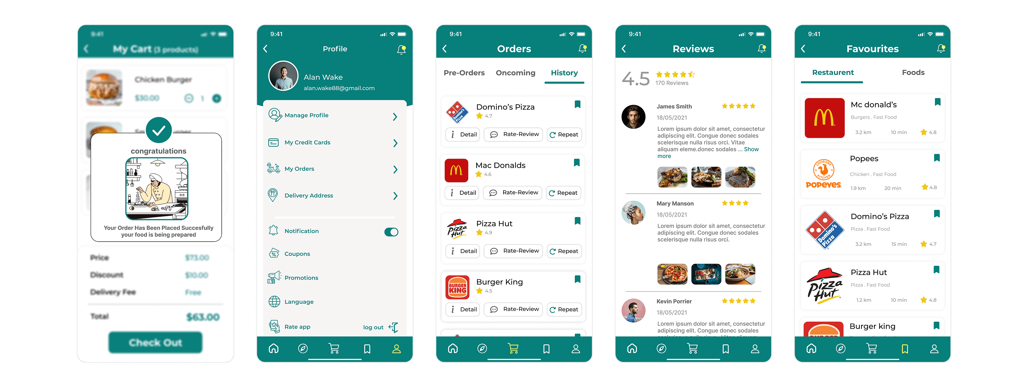
Trust-Building Rating & Feedback Loop
Problem: Users who have a poor experience and cannot express it immediately churn silently.
Solution: Post-delivery, users are prompted with a simple star rating flow. Negative ratings trigger an optional qualitative follow-up and flag the order for operations review. Positive ratings prompt an in-app store review request improving public ratings organically.
Collaboration
Throughout the project, I collaborated closely with product stakeholders, the development team, and marketing aligning on the feature roadmap to support business goals such as GMV growth and user retention, ensuring design feasibility within sprint cycles by proactively flagging potential engineering complexities (e.g., the live tracking feature), and maintaining consistency with brand positioning through a bold teal and yellow visual language.
Challenges
I navigated key challenges around scope management and user ambiguity by applying structured prioritisation and rapid research methods. When stakeholders introduced out-of-scope features mid-project (e.g., an in-app loyalty programme and group ordering mode), I used a MoSCoW framework to prioritise V1 essentials versus V2 opportunities ,keeping the project on schedule while defining a clear future roadmap. Additionally, when the ‘exploratory’ user persona proved too vague, I conducted a rapid card-sorting exercise with six participants, using the insights to refine the category grid’s structure and labelling.
Impact & Results
Analytics data from the first release showed strong early performance across key user flows, indicating a successful product launch:
Core Flow Completion: Reached 92%, showing that most users were able to complete key journeys without friction.
Time to First Order: Averaged 2m 41s, demonstrating a fast and efficient onboarding and ordering experience for new users.
SUS Score (Post-Launch Survey): Recorded at 82.5, reflecting strong perceived usability and positive early user feedback.
Sign-Up Drop-off: Measured at 11%, suggesting a smooth onboarding experience with minimal user friction.
Tracking Experience: 90% of users found the order tracking feature helpful, highlighting its value in improving post-purchase confidence.

