INDUSTRY:
B2B - SaaS
YEAR:
2025
Role:
Product Designer

About
Cherrydeck is a content production platform that connects businesses with photographers and videographers to create a wide range of branded content. Like most two-sided creative marketplaces, its value hinges on a simple but elusive promise: the right work should find the right client. For a long time, it couldn't reliably deliver on that promise.
This case study covers the end-to-end UI/UX design of two interconnected features that shipped in mid 2025: an AI-powered tag generation system that automatically enriches every uploaded photo with structured, professional metadata, and a tag-driven search experience that makes that metadata findable, explorable, and actionable for clients. These weren't two separate projects bolted together they were one product investment in discoverability, designed and shipped as a coherent system.
My Role
I was the product designer on this feature, owning the full design process from initial research through final handoff.
That meant running user interviews, synthesizing research into a problem frame the team could align on, designing and prototyping all screens and interaction states across both the photographer-upload side and the client-search side, building the Figma prototype used in usability testing, writing the component specs, and collaborating closely with PM and engineering throughout implementation.
The Problem
Cherrydeck had a discoverability gap that was quietly limiting the platform's value on both sides of the marketplace.
Photographers uploaded work, and it sat there. Clients came to search, and the search was blunt keyword strings matched against whatever text a photographer might have manually written into their profile or image titles. The system was only as smart as the effort a user put into it, and most users put in very little. Not out of laziness, but because tagging is genuinely hard work, especially at scale. A photographer uploading 30 images from a single shoot doesn't want to sit and categorize each one. They want to hit upload and get back to shooting.
On the client side, the experience was equally frustrating. Searching for "warm light editorial portrait" returned nothing or worse, returned photos that clearly didn't match because the search logic couldn't parse intent. The gap between what clients were looking for and what the platform could retrieve was significant.
We had data that confirmed this: engagement on search was low, time-to-contact was high, and our internal surveys showed that photographers with more complete metadata profiles were getting 2x more profile views than those who left fields empty. That number (2x) became a north star we kept coming back to throughout the design process.
The core question we set out to answer was: how do we make every photo on the platform intelligently discoverable, without turning the upload experience into a chore?
Research & Discovery
Before touching any wireframes, I needed to understand where the friction actually lived. I conducted a mix of contextual interviews with photographers (ranging from hobbyists to working professionals who use Cherrydeck as a primary business channel) and shadowed the upload flows to watch where people hesitated, skipped, or abandoned steps. A few clear patterns emerged quickly.
Photographers understood the value of tagging in the abstract "yes, I know it helps clients find me" but the practice felt disconnected from their creative workflow. After a shoot, they're editing and culling, often in Lightroom or Capture One. By the time they exported and uploaded to Cherrydeck, they were mentally finished with that project. Adding metadata felt like filing paperwork after a long day of real work.
We also found that photographers varied enormously in their domain vocabulary. A seasoned editorial shooter knows terms like "bokeh," "shallow depth of field," or "muted editorial palette." A newer photographer might describe the same photo as "soft blurry background" or simply not know the professional terminology clients use when searching. This vocabulary mismatch was significant it meant the problem wasn't just about effort, it was about fluency.
For clients and brand-side users, their search behavior was more nuanced than a simple keyword lookup. They often searched by mood, use case, or aesthetic quality things like "summer, outdoor, warm, casual" rather than specific technical parameters. They wanted the platform to understand what they were after, not require them to construct perfect Boolean queries.
From this research I extracted three design principles that would guide the rest of the work:
Meet people where they are. Tagging should slot into the existing upload flow, not require a separate effort or dedicated session.
AI should do the heavy lifting; humans should have control. The system should generate tags automatically, but photographers need to feel ownership over what represents their work.
Search should understand intent, not just match strings. The client experience needed to surface semantically relevant content, not just literal keyword matches.
Define
After synthesizing the research, I wrote a problem statement the entire team could align on:
Photographers don't tag their work because it's effortful and disconnected from their creative flow. Clients can't find the right work because search operates on a vocabulary mismatch. The platform has the data to close both gaps but needs a system that makes tagging effortless enough to actually happen, and search smart enough to actually surface the right content.
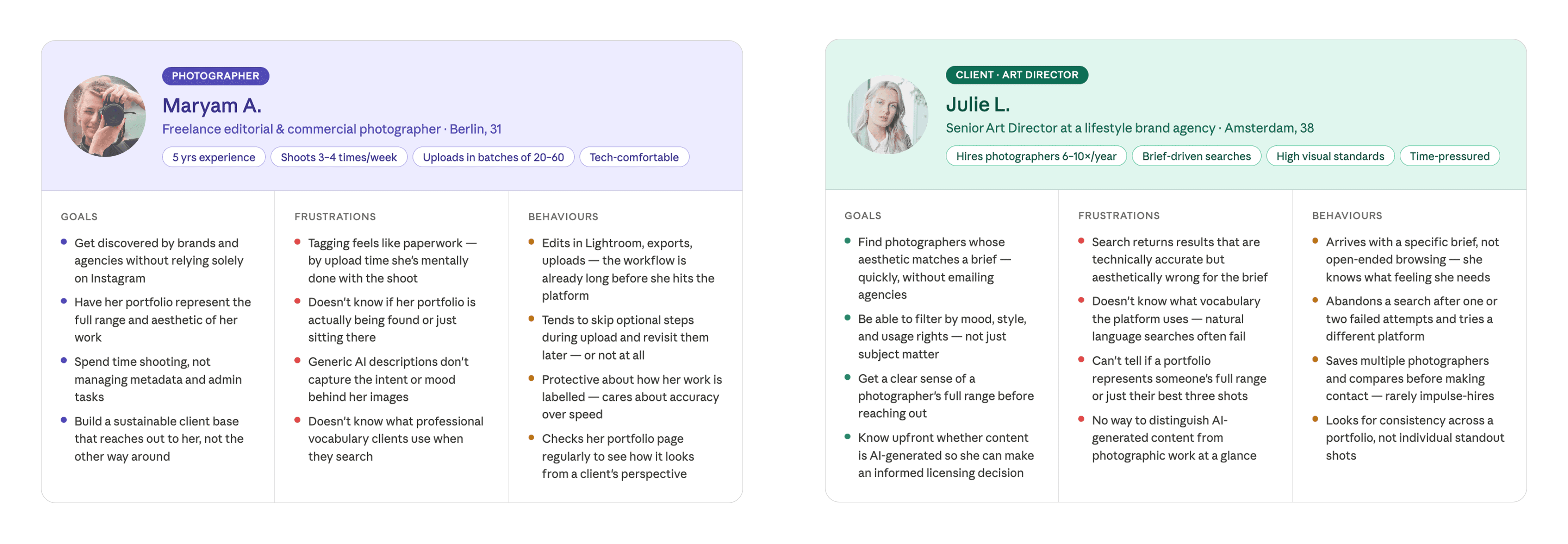
From this I defined two primary user personas:
The working photographer : uploads regularly, values their time, cares about how their work looks to potential clients, and wants any metadata system to work with their flow, not against it. She needs the AI to do the tagging, but needs enough control to feel like the output still represents her eye.
The commercial client / art director : comes to Cherrydeck with a specific brief in mind, often searches qualitatively (mood, aesthetic, use case), and needs search to be smart enough to bridge the gap between how they describe what they want and how photographers categorize what they shoot.
Success metrics were defined early and deliberately:
Percentage of uploaded photos with complete tag sets (baseline to compare post-launch)
Time spent on the tag review screen per photo (a proxy for usability : too long means it's confusing; too short could mean users are skipping)
Search-to-contact conversion rate
Profile views for tagged vs. untagged portfolio
Design Prototype, From Lo-Fi to Mid-fidelity
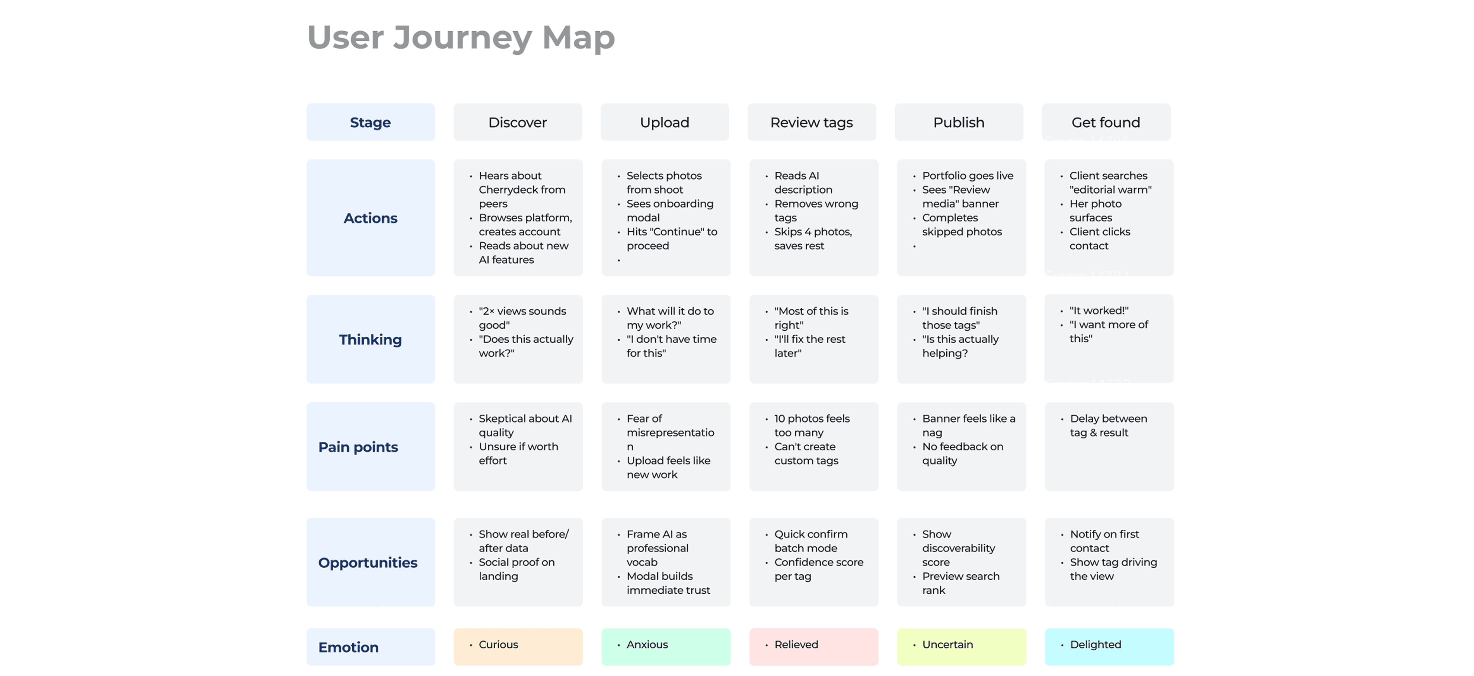
My process on this project moved through three fidelity stages. I started with paper sketches and rough Figma frames to work through the information architecture what the tag review screen needed to contain, how it should be laid out, how navigation between photos would work.
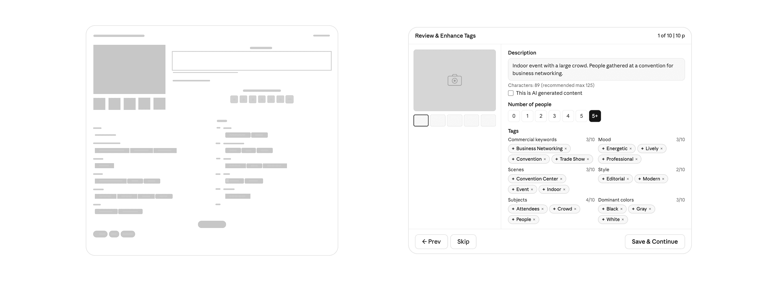
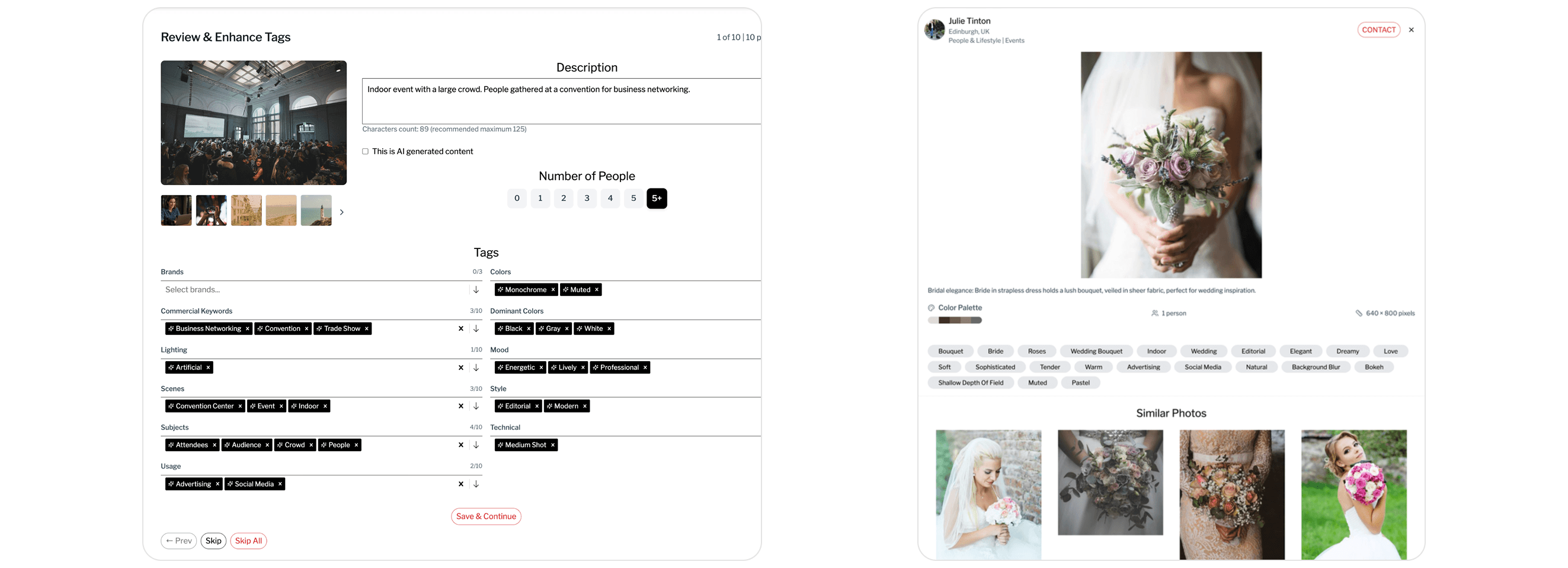
The key structural question in early wireframing was how to handle the sheer volume of information on the tag review screen. Twelve tag categories, a photo description, a people count selector, an AI-content flag, and navigation between photos all on one surface. The risk of it feeling overwhelming was real.
I explored a tabbed approach (categories split across tabs), an accordion approach (categories collapsed by default), and the flat two-column layout that ultimately shipped. The flat layout won because it keeps all categories visible simultaneously, making it easy to scan what's been tagged and what's missing. It also makes the AI's completeness apparent at a glance the count indicator beside each category (e.g., "3/10 Commercial Keywords") communicates how thorough the tagging is without requiring any additional UI.
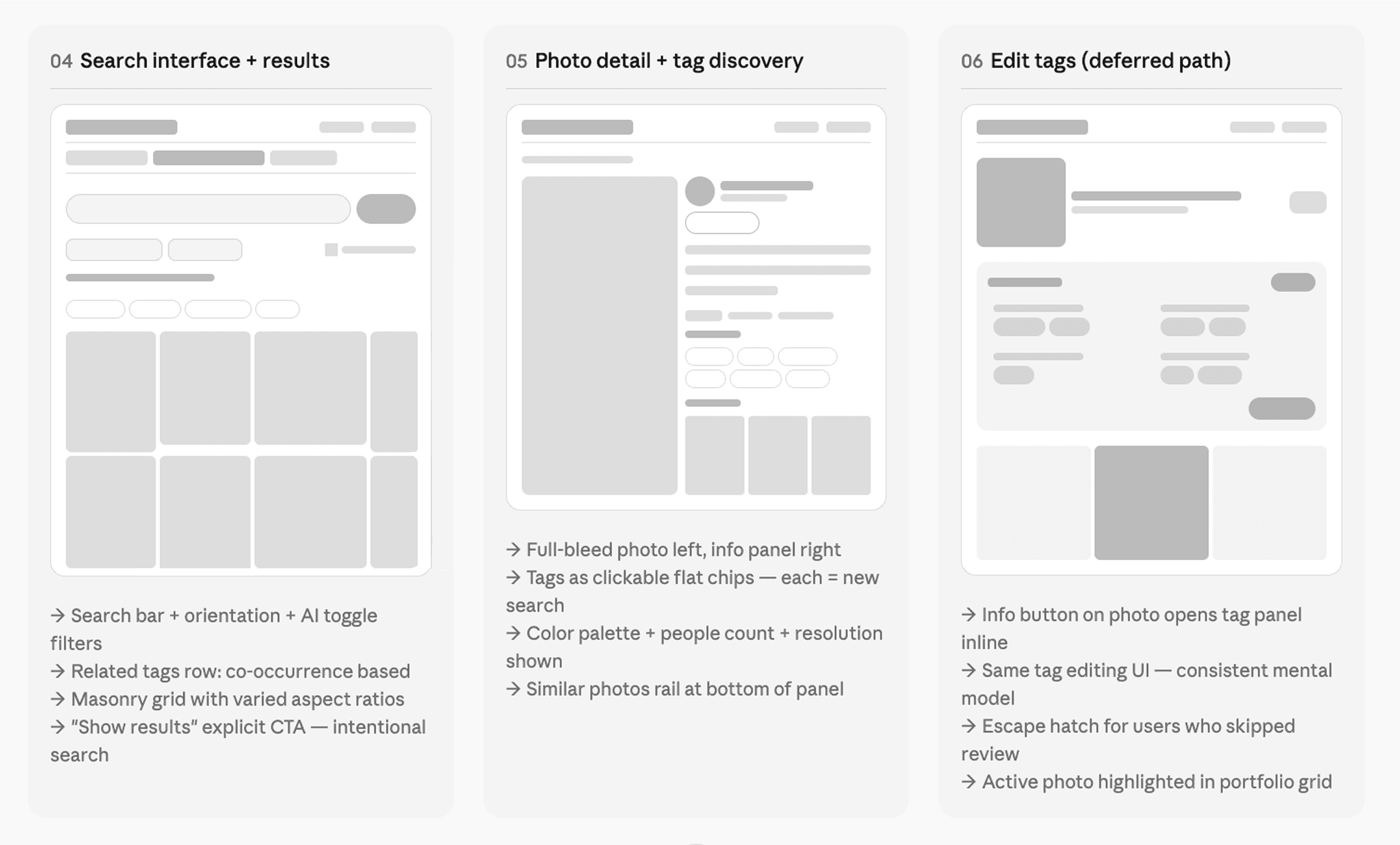
Mid-fidelity wireframes were used to pressure-test the flow: what happens when a user skips a photo? What if they skip the entire session? What's the re-entry point? Mapping these edge cases early prevented scope surprises in later stages.
High-Fidelity UI
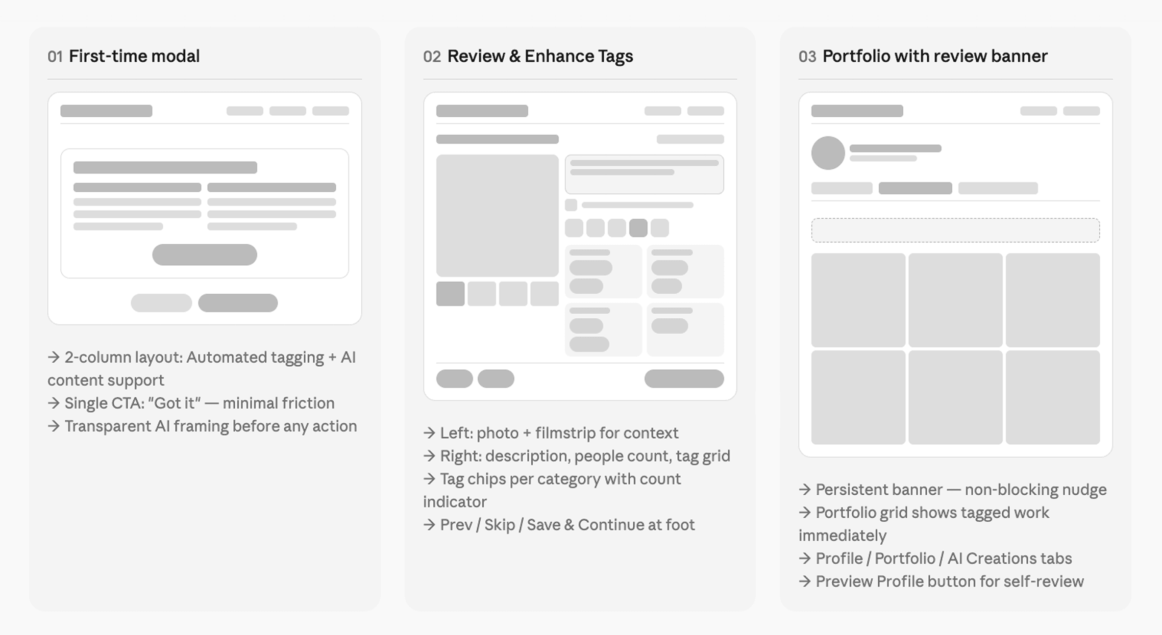
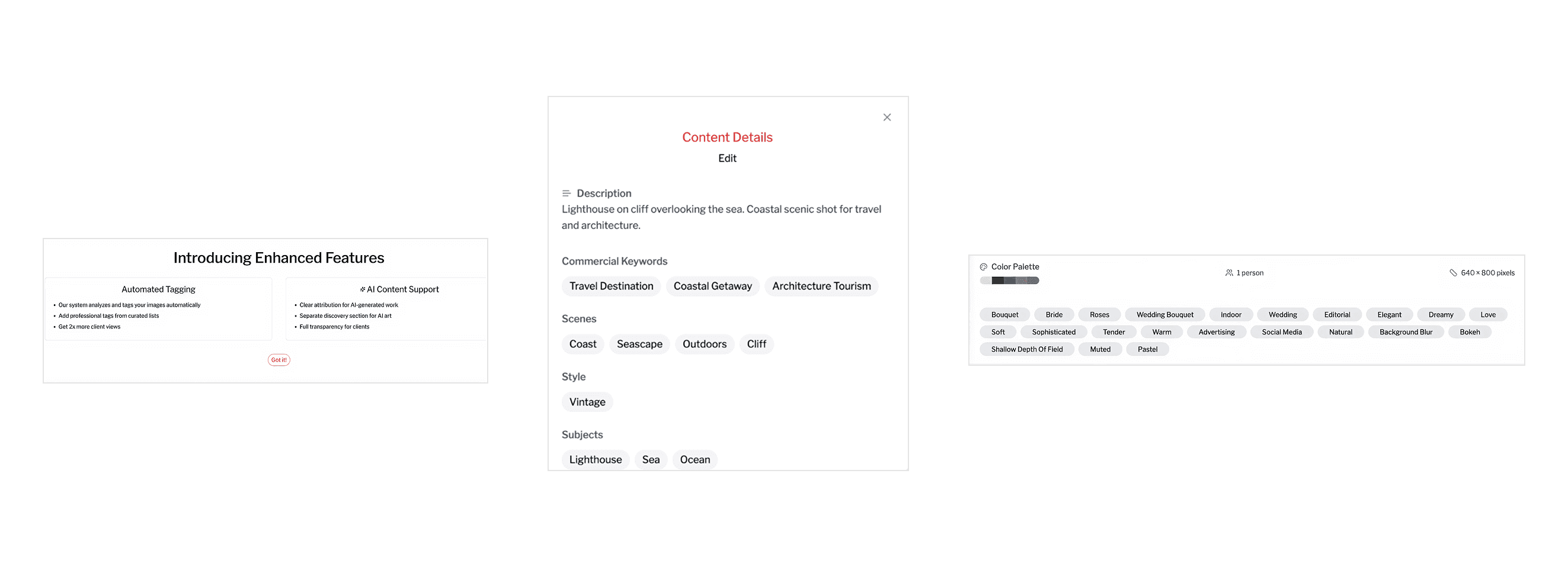
The onboarding modal is deliberately minimal two columns, two ideas. It answers the inevitable "what is this thing doing to my work?" before anxiety can form. The design principle here was transparent by default: explain the AI involvement upfront, lead with the user benefit, and address AI-generated content separately rather than burying it.
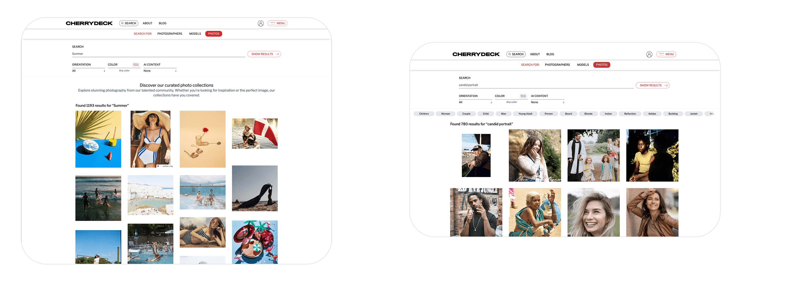
The search interface carries its own design logic. The placeholder text "Search photos by tags, style, mood…" immediately signals that the system understands qualitative language, not just keyword strings. The related tags row above the grid is algorithmically derived from tag co-occurrence and acts as a vocabulary guide: clients who search "Summer" and see "Golden Hour," "Outdoor," "Warm," "Lifestyle" are being taught the language of the platform while simultaneously narrowing toward their actual intent. The explicit "Show Results" button (rather than instant search) was a deliberate choice: search here is a deliberate, commercial-intent action, not casual browsing.
The photo detail view is where the tag system's real power becomes tangible for clients. Every tag is a tappable search filter clicking "Shallow Depth of Field" instantly surfaces every photo on the platform with that attribute. This turns every detail view into a branching navigation pathway. A client might enter through a wedding search, open a bridal portrait, click "Editorial," and discover 400 more editorial portraits they didn't know they were looking for. The similar photos rail at the bottom adds another dimension of exploration, extending dwell time and increasing the likelihood of a contact action.
Usability Testing
I ran moderated usability testing with eight participants five photographers (ranging from part-time to full-time working professionals) and three clients (brand-side and agency). Sessions were 30 minutes each, conducted remotely over video call with screen share.
The goal was to ensure that the AI-assisted tagging workflow reduced effort for creators while improving search relevance and discovery for clients.
Participants were asked to complete realistic tasks such as uploading images, reviewing AI-generated tags, skipping and editing tags later, searching for specific types of images, and exploring content using filters and tags. Sessions were moderated and participants were encouraged to think aloud to better understand their expectations, behaviors, and pain points.
The feedback revealed a few key areas for improvement. Some users needed clearer visual cues for editable tags, while others overlooked certain filters in the search interface. On the client side, participants strongly engaged with clickable tags, using them to explore related content, which validated the discovery approach.
Based on these insights, we refined the designs by improving the visibility of filters, strengthening tag affordances, and enhancing reminders for incomplete tagging. These iterations helped create a more intuitive, efficient, and scalable experience for both creators and clients.
Outcomes & Reflection
This feature shipped on Cherrydeck in mid 2025. The north star we worked toward throughout 2x more client views for tagged portfolios was the same promise we made to photographers in the onboarding modal, and measuring against it gave the team a clear signal to optimize toward.
From a design craft perspective, what I found most satisfying about this project was how deeply the upload-side and search-side experiences needed to be designed in relation to each other. The tags a photographer sees during review are the same tags a client clicks through in search results. The vocabulary curated in the taxonomy is what makes the related tags row in search feel coherent. The AI-generated description written at upload is what appears under a photo when a client is considering whether to make contact.
When you're designing a two-sided marketplace feature, every decision you make for one user type ripples into the experience of the other. That constraint is challenging, but it also creates an unusually coherent product when you get it right a system where the value flows clearly from photographer to platform to client, and the design serves the whole chain.

