INDUSTRY:
E-commerce
YEAR:
2024
Role:
UI/UX Designer

About
Von Heesen is a direct-to-consumer leather goods brand with a distinctive German craft identity. Their product pages carry strong brand equity premium materials, handcrafted construction, a loyal customer base but the digital experience wasn't doing justice to the physical product.
The buy box is the most critical real estate on any e-commerce product detail page. It's the zone where a user makes their purchase decision: they read the price, evaluate variants, assess trust signals, and commit. If anything in that sequence creates friction or uncertainty, the user doesn't convert.
I was tasked with redesigning the buy box on mobile not the full page, just that focused decision zone to reduce cognitive friction and improve conversion intent.
challenge
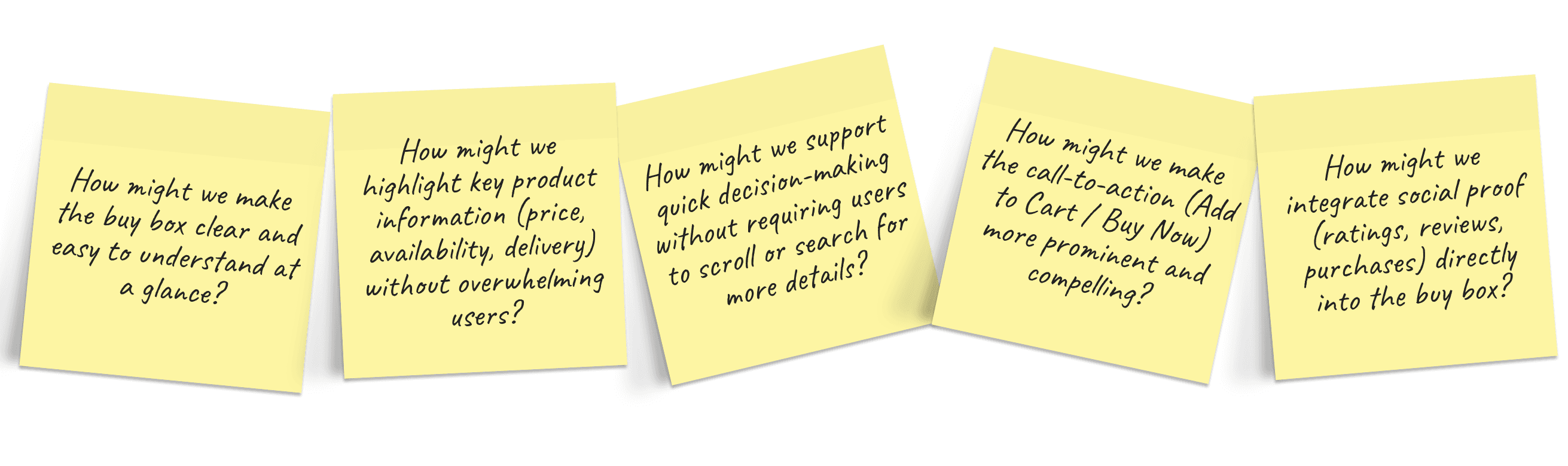
Before designing anything, I needed to understand what was actually breaking the experience.
Hotjar heatmap analysis showed users tapping repeatedly and hesitantly around the color swatches and variant toggles, a clear sign of uncertainty, not confident selection. There was also a significant drop-off between the variant selectors and the Add to Bag button, with users tapping around the trust badges and payment section instead. They were looking for reassurance and not finding it at the right moment.
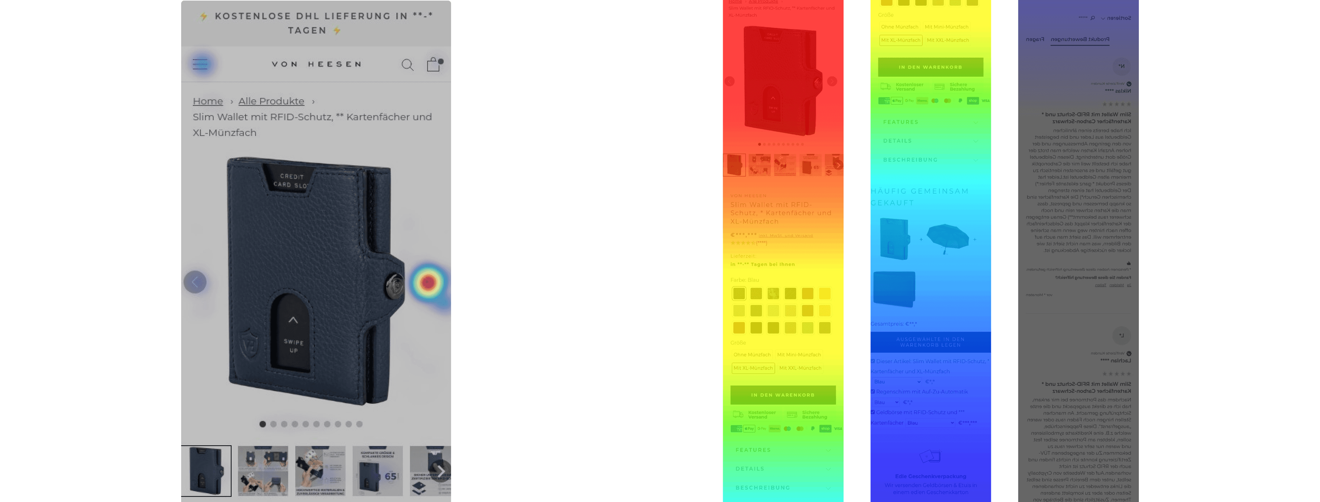
A heuristic review of the existing design surfaced the structural reasons why:
The image gallery was static and small
Color swatches were undersized with a weak selected state users couldn't tell what they'd chosen
Size and format toggles looked the same whether selected or not
Trust signals appeared after the CTA, arriving too late to actually influence the decision
The savings badge used bright yellow completely off-brand for a premium leather goods company
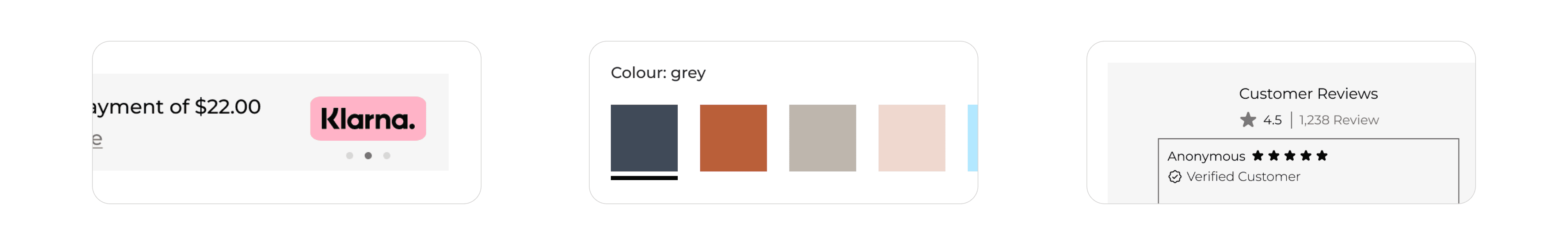
The Klarna widget used third-party styling that clashed with Von Heesen's aesthetic
The core problem: The buy box wasn't guiding users through a decision it was making them do all the work themselves.
I collaborated with the stakeholders to understand their concerns, gather data, and learn about the product and current workflows in the team.
He confirmed that the color selector confusion was a known issue it had generated real customer support tickets from users who received the wrong color because the selected state wasn't clear enough. That validated the heatmap data immediately and made fixing the color selector a shared priority, not just a design opinion.
I also worked closely with the engineering team to ensure the proposed solutions were technically feasible and could be smoothly integrated into the existing system.
The engineer flagged that the Klarna widget had contractual styling constraints tied to the partner integration, which meant a full visual redesign of that element wasn't feasible. Knowing this early saved time and shaped the approach rather than fighting the constraint, I reduced the widget's footprint to a single clean inline text line that preserved the information without the visual disruption.
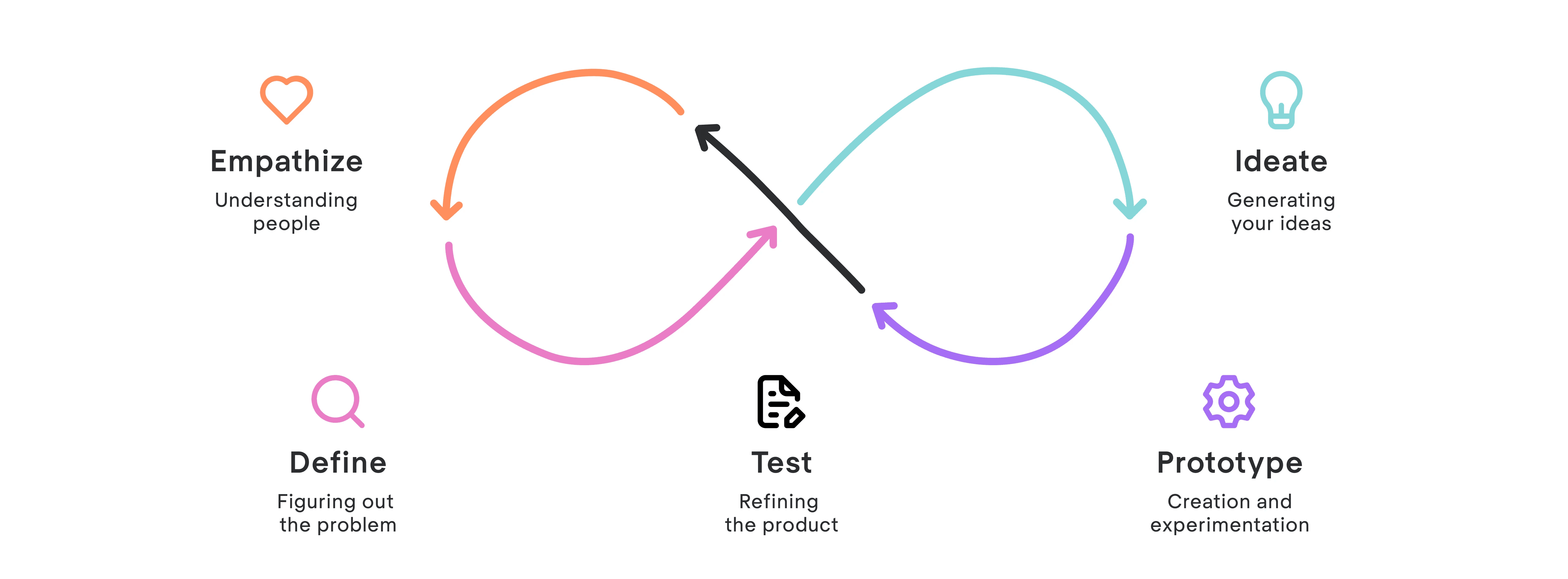
Define & Ideate
User needs
From the research and team alignment, I defined three core user needs that the redesign had to satisfy:
Users need to see the product properly before they commit. A premium leather wallet is a considered purchase. Users need high-quality imagery that communicates texture, scale, and finish especially on mobile, where touch is removed from the equation entirely.
Users need to feel certain about their variant selection. Any ambiguity about which color, size, or format is currently selected creates anxiety that interrupts the path to purchase.
Users need trust signals at the right moment. Reassurance about materials, certifications, and returns must arrive before the CTA, not after it.
Design principles
I established three principles to act as decision filters throughout the rest of the process:
Show before you sell. The product imagery must do the sensory work that a physical retail environment would do. Every image is a reason to trust the product.
One decision at a time. The buy box should guide the user through a clear sequence understand the product, choose the variant, feel confident, act with each element serving exactly one stage of that sequence.
Earn the click. The Add to Bag button should be the natural conclusion of an experience that has already resolved every doubt, not a prompt that interrupts the user before they're ready.
Benchmarking
I also reviewed how comparable premium DTC brands structure their mobile buy boxes, using the Amazon product listing for the same wallet as an additional reference point. The consistent pattern on high-performing product pages was tight sequential structure:
rich imagery → price and clarity → variant selection → trust signals → CTA → payment flexibility.
The goal was to bring the Von Heesen experience into alignment with this structure while keeping it faithful to the brand's own visual identity.
Design Process
Lo-fi sketches
I started with paper sketches, exploring around eight to ten rough layout variations. The questions I was working through: how much space should the gallery take? Where do the trust signals sit relative to the CTA? How does the product information get organized so it's fast to scan?
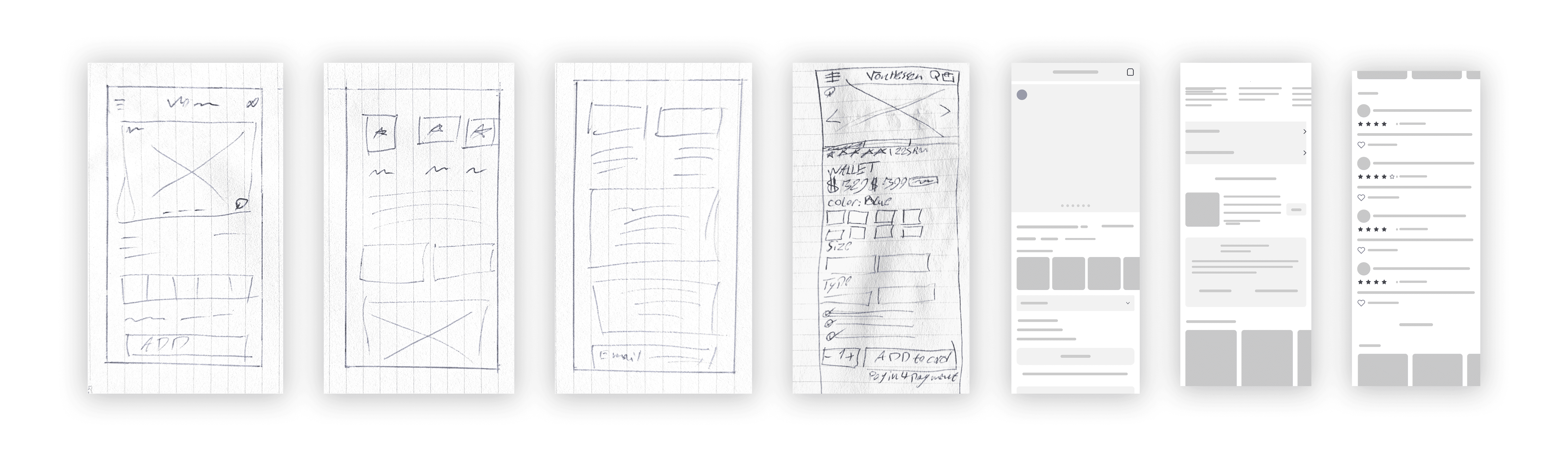
A clear structure emerged: large gallery → price and variant selection → trust signals → CTA → payment info. Simple, sequential, no ambiguity.
Mid-fi wireframes
I brought the strongest sketch into Figma as a grayscale wireframe to test proportions on a real mobile viewport. Two rounds of iteration, adjusting spacing and component sizing. The main tension was giving the imagery and trust signals enough room to do their job while keeping the CTA accessible without excessive scrolling.
High-fidelity design
Once the structure was solid, I applied Von Heesen's visual language and moved into the final design.
The Redesign
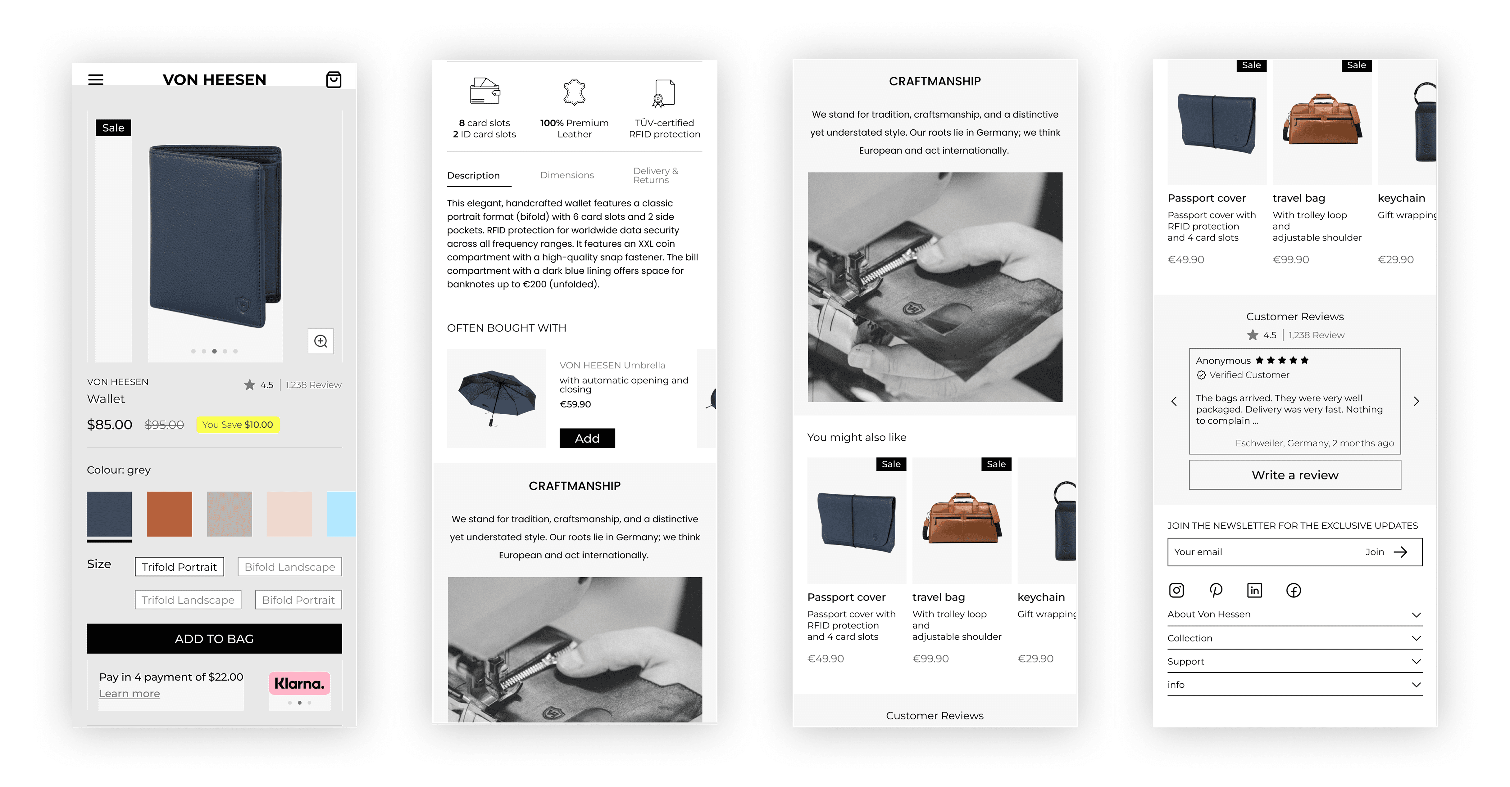
Bigger, interactive image gallery The gallery became the entry point into the product. High-resolution images, a zoom feature, and thumbnail indicators so users always know how many views are available. For a handcrafted leather wallet, the imagery is the primary trust signal the redesign treats it that way.
Cleaner price and savings presentation The savings indicator was removed from its yellow badge format and replaced with a subtle inline label that fits the brand. Same information, right tone.
Unambiguous variant selection Color swatches were enlarged with generous spacing. The selected state now uses a clear ring treatment plus a text label beneath the swatches showing the color name no more guessing. Size and format toggles were redesigned with a solid fill for the selected option and a bordered style for inactive ones. The difference is immediate.
Trust signals moved above the CTA This was the most important structural change. Users need reassurance before they commit, not after. The trust badge row, card capacity, leather quality, RFID protection now sits directly above the Add to Bag button where it actually influences the decision.
Scannable product information Description, dimensions, and delivery information were reorganized into clearly labeled sections with icons and bullet points. Users can find what they need in seconds rather than reading through a block of text.
Craftsmanship section A dedicated section below the buy box tells the Von Heesen brand story through editorial copy and photography. It answers the emotional question, why is this worth xxx ,that the buy box alone can't answer.
Horizontal carousels for recommendations and reviews "Often Bought With" and customer reviews were redesigned as horizontal swipe carousels, cutting the overall page length significantly and reducing scrolling fatigue.
Reflection & Next Steps
The most important thing this project reinforced is that great buy box design is not about aesthetics it is about sequence. The question is not "does this look good" but "does this experience guide a user from uncertainty to confidence to action without friction?" Every decision in this redesign was ultimately an answer to that question.
Longer term, I would explore two additions to the page: a size guide accessible directly from the size selector, which would reduce purchase hesitation for first-time buyers; and a sticky Add to Bag button that follows the user as they scroll through the product information and craftsmanship sections, ensuring the action is always one tap away regardless of where on the page the user is reading.
The broader strategic opportunity for Von Heesen remains the same one I identified at the outset: closing the gap between the quality of the physical product and the quality of the digital experience that represents it. This redesign takes a significant step in that direction. The work of fully closing that gap is ongoing.