INDUSTRY:
B2C
YEAR:
2023
ROLE:
UI/UX DESIGNER

Intro
UniBank is a web-based personal finance dashboard used by individuals who want a clearer picture of their financial life. It consolidates balance tracking, transaction history, card management, spending analytics, payment flows, and budget planning into one interface, replacing the tab-switching, app-juggling, and mental arithmetic that most people currently call "managing their finances."
The product is used primarily on desktop, with sessions concentrated in the morning and at the end of the working week. Most sessions are short ( under two minutes ) which shaped every layout decision we made. The interface has to earn its usefulness fast.
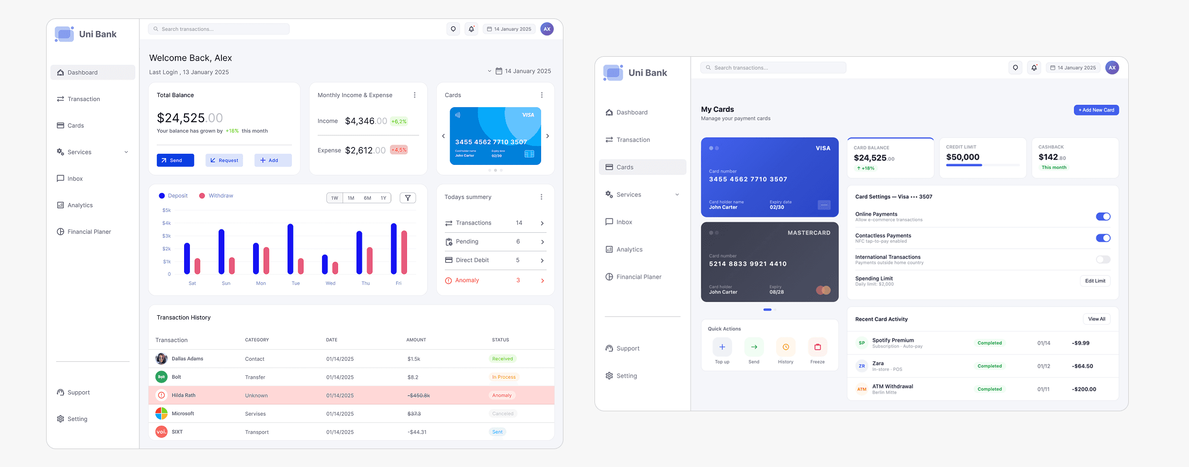
Structurally, UniBank is built around a fixed left sidebar, a persistent topbar, and a card-based content grid that stays consistent across all seven screens. The visual language is deliberately restrained: an off-white background, white card surfaces, one primary blue, and a tightly controlled semantic color system that communicates status without decoration.
Problem Statement
Most banking dashboards are built for banks, not for people.
The average banking app shows you a balance and a list of transactions. That's it. But real financial life is messier than that — multiple cards, recurring subscriptions you forgot you signed up for, irregular income, spending patterns you only notice when it's already too late.
People aren't bad at money. They're just not given the right information at the right time.
During early conversations with users, three recurring frustrations kept surfacing:
No meaningful context. Flat transaction lists tell you what happened, never why it matters. Users couldn't tell whether they were spending more than usual without doing the math in their heads.
Buried anomalies. Suspicious or duplicate charges were invisible in a sea of normal transactions. By the time most users noticed, it was already past the dispute window.
Fragmented card management. Managing multiple cards meant navigating between different screens or apps. Spending limits, freeze states, and card-specific history all lived in different places, as if the product didn't know these things were related.
The underlying issue wasn't the data, banks have plenty of it. It was the presentation layer: information organized by database logic instead of how humans actually think about money.
My Role
I led the end-to-end design process for this project, driving the experience from early exploration through to final UI delivery.
I collaborated closely with a product manager and two fellow designers to align on product goals, share ideas, and iterate on solutions. Together, we translated business requirements into intuitive user experiences while maintaining a consistent design direction.
I also worked with key stakeholders to understand priorities, gather insights, and ensure the product addressed real user and business needs.
Throughout the process, I partnered with the engineering team to validate concepts, ensuring that all design solutions were technically feasible and could be smoothly integrated into the existing system.
Goals & Objectives
What "success" meant here.
Rather than starting from a feature list, I anchored the project around three layers of intent: what users need to feel, what they need to do, and what the product needs to prove.
UX Goals
Give users a financial snapshot in under 5 seconds. balance, recent activity, anomalies, without requiring them to dig.
Make anomaly detection visible and actionable. flagged transactions surfaced prominently, not hidden behind a filter.
Reduce cognitive load through progressive disclosure. show the summary, let users drill down when they choose to.
Create a single source of truth for cards. balances, limits, freeze status, and history, all in one place.
Business Goals
Increase daily active engagement by making the dashboard a useful tool, not just a check-in.
Reduce support tickets by surfacing budget alerts and anomalies before users have to call.
Build trust through transparency. every balance, every change, clearly explained.
Research & Insights
Competitive Analysis
I reviewed several of the most popular banking and fintech products, along with a traditional bank app, and found a clear split: challengers prioritized spending insights, while traditional banks focused on transaction volume and compliance-driven layouts.
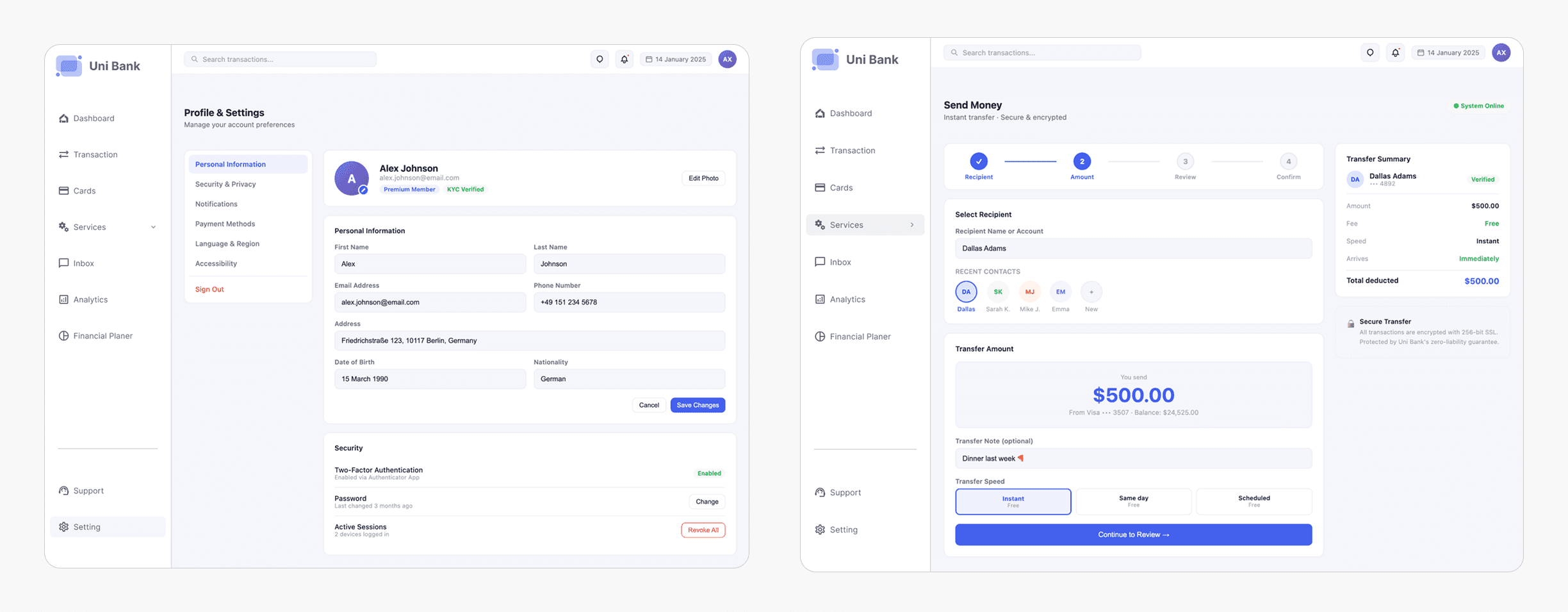
The best-in-class pattern across all of them: a persistent balance hero, category-based spending breakdowns, and inline transaction statuses. The worst pattern: modal-heavy flows for simple actions like freezing a card or initiating a transfer.
User Behavior Patterns
From behavioral interviews with 7 participants (ages 24–46, mixed income), I extracted three patterns that shaped almost every design decision that followed:
The Monday Morning Check: All 7 users checked their banking app at the start of the week. Their first question was always the same: how much do I have? Not what did I spend it on.
Notification Fatigue: Five of the seven had disabled push notifications because they were too frequent and too vague. They were missing genuinely important alerts because the noise drowned out the signal.
Month-End Panic: Most users had no awareness of their budget status until they were close to or already over their limit. Retroactive analysis was the dominant pattern, not proactive awareness.
Key Design Insights
Insight 1: Balance is the primary metric users care about. Everything else is secondary. The dashboard must lead with it, not bury it behind graphs.
Insight 2: "Anomaly" is an emotionally loaded word. Visual treatment needs to communicate urgency without causing panic. Color and language both matter here.
Insight 3: Users treat their banking app like a weather app. quick glance, actionable insight, done. Most sessions are under 90 seconds. The design must optimize for that reality, not for long-form exploration.
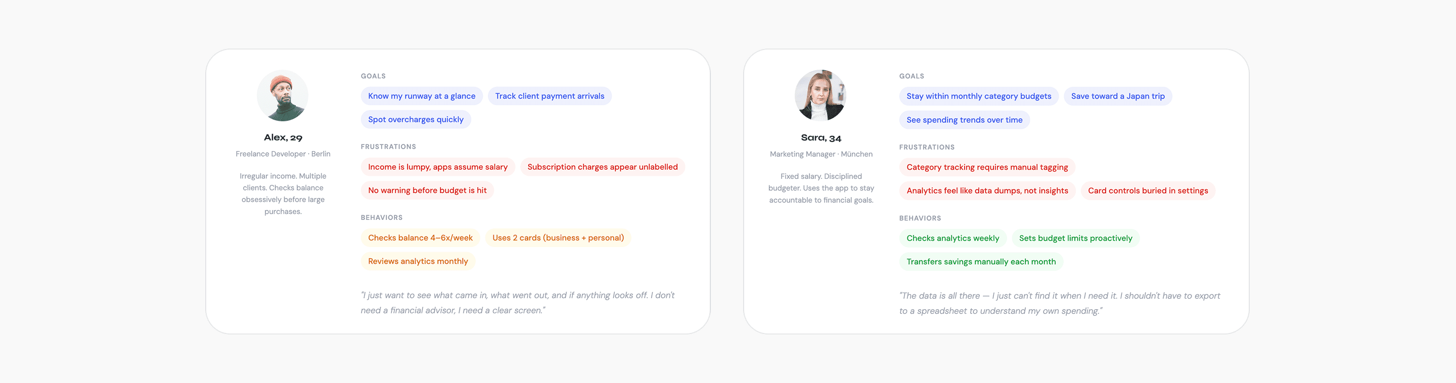
User Personas
Two users. Very different relationships with money.
Design Strategy
Three principles that drove every decision.
1. Clarity over comprehensiveness
The temptation in fintech dashboards is to show everything every metric, every chart, every edge case. I resisted this throughout. The rule I set early: if a piece of information doesn't change what the user does next, it doesn't belong on the primary view. Secondary data lives one click deeper.
2. Hierarchy before visual style
I wireframed in monochrome for two full weeks before applying any color. This forced clear thinking about what was primary (balance, anomalies, recent transactions), secondary (category breakdowns, card status), and tertiary (historical analytics, account settings). Color was applied only after the spatial hierarchy was already working on its own.
3. Modularity as a design constraint
Every card component on the dashboard is self-contained, it has a title, a primary metric, a secondary context indicator, and an action affordance. This created consistency across all seven screens without over-prescribing layout. It also made the design more maintainable and easier to extend when new data types were added later.
Design
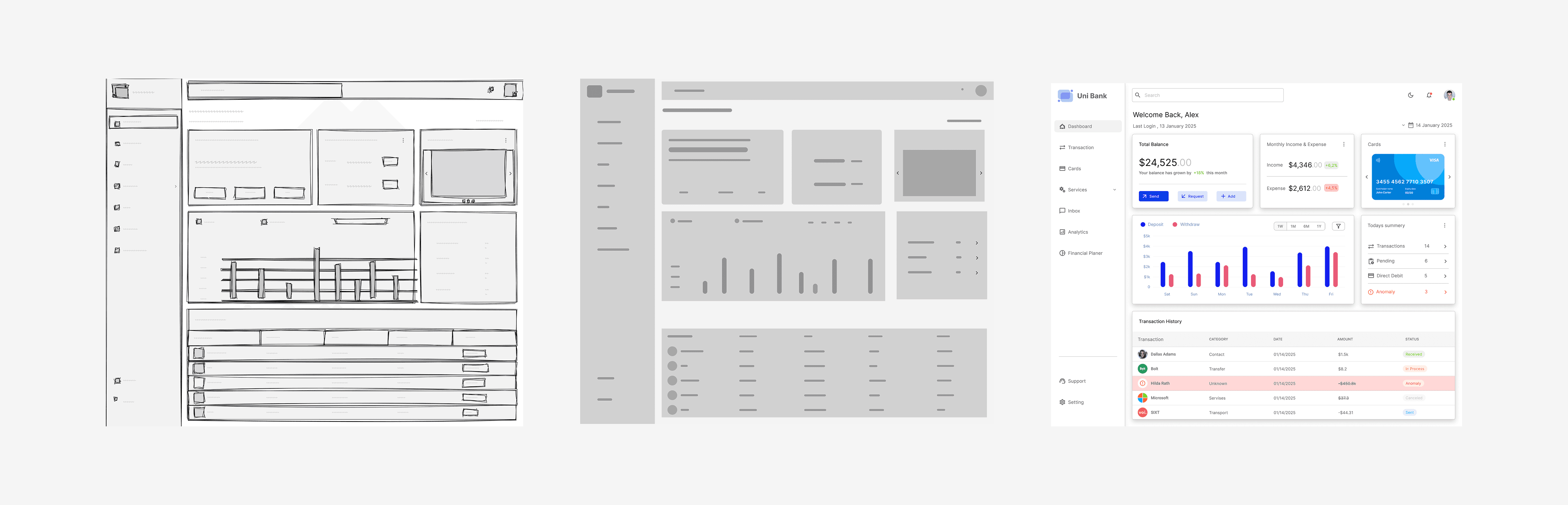
Low Fidelity
The first pass was entirely paper-based, focused on one question: what is the first thing a user should see? Early sketches placed the balance in a full-width hero area with transactions below, but it felt like every other banking app. A balance at the top, a list at the bottom.
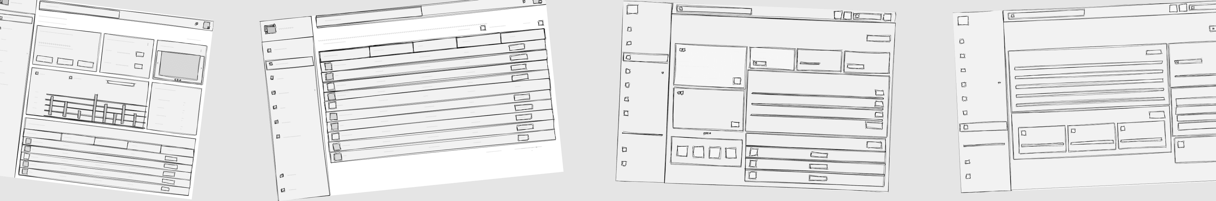
The breakthrough came from sketching the card-grid layout: chunking the screen into bounded content blocks rather than continuous sections. That mental model shift drove everything that came after.
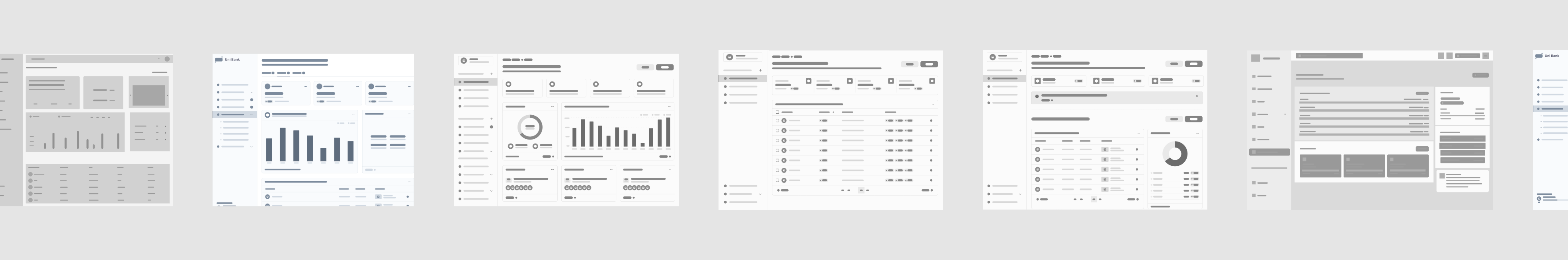
Mid Fidelity
Moving to Figma, the card grid became a proper layout system. The sidebar locked in as a fixed navigation element, which immediately freed the content area from carrying any wayfinding weight. The topbar was deliberately constrained to three elements: search, notifications, and date context. Every other element that was proposed for the topbar, user name, account switcher, quick balance was removed. The topbar should orient, not inform.
High Fidelity
High fidelity began only after the wireframes had been reviewed and validated with two participants in informal walkthroughs. Every state was designed before any screen was marked complete empty states, loading states, error states, and the anomaly state all received explicit treatment. A screen that only exists in its happy-path state isn't a finished design.
There’s no “I” in Team
Communication with Product & Design Team
To ensure a cohesive and well-aligned product experience, strong communication across the team was essential. I worked closely with the product manager and fellow designers to maintain clarity on goals, priorities, and design direction.
We held regular syncs to review progress, share feedback, and collaboratively iterate on solutions. These sessions created space for open discussion, allowing us to challenge ideas, refine concepts, and align on the best possible user experience.
Communication with Engineering
Collaboration with the engineering team was a key part of the process to ensure that designs were both practical and implementable.
We maintained regular check-ins to walk through design decisions, review components, and discuss technical considerations. This ongoing dialogue helped bridge the gap between design and development, creating a shared understanding of the product.
Engineers were involved throughout the design process, from early concepts to final handoff allowing us to validate ideas early, adapt to constraints, and avoid unnecessary rework. This approach ensured that the final solutions were not only user-centered but also efficient to build and scale.
Challenges & Solutions
Communicating anomalies without creating anxiety
The risk with flagging unusual transactions is that the treatment either goes unnoticed or causes disproportionate alarm. Too subtle and users scroll past it. Too alarming and users feel their account is under threat every time they log in.
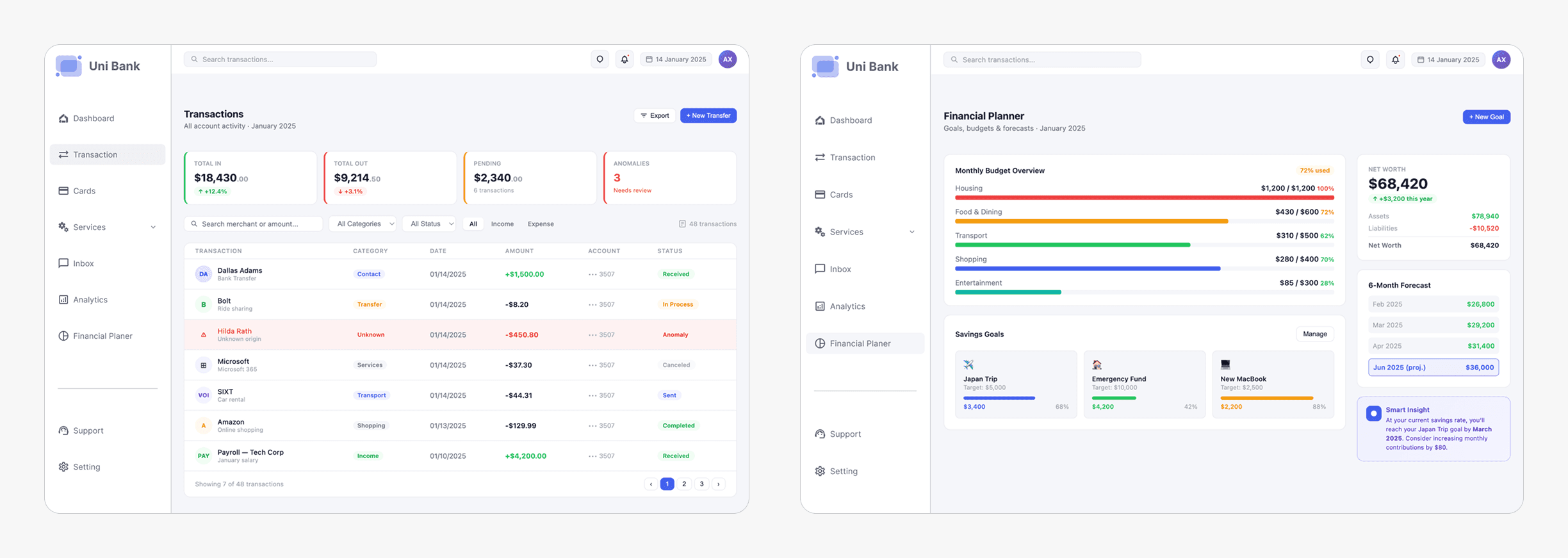
The solution was a tiered system. The red row background persistent, full-width makes anomalies impossible to overlook. The "Anomaly" badge adds a labelled category. The detail panel, opened on click, explains specifically what was detected and what the user can do about it. The language was calibrated deliberately: "unusual activity detected" rather than "fraud alert", which consistently produced stronger anxiety responses in testing without adding any actual information.
Dense analytics that don't feel like a data dump
Six months of spending history, category breakdowns, and merchant rankings occupy the same screen. The risk was creating something that communicates "this is for finance people" and loses every user who just wants a quick answer.
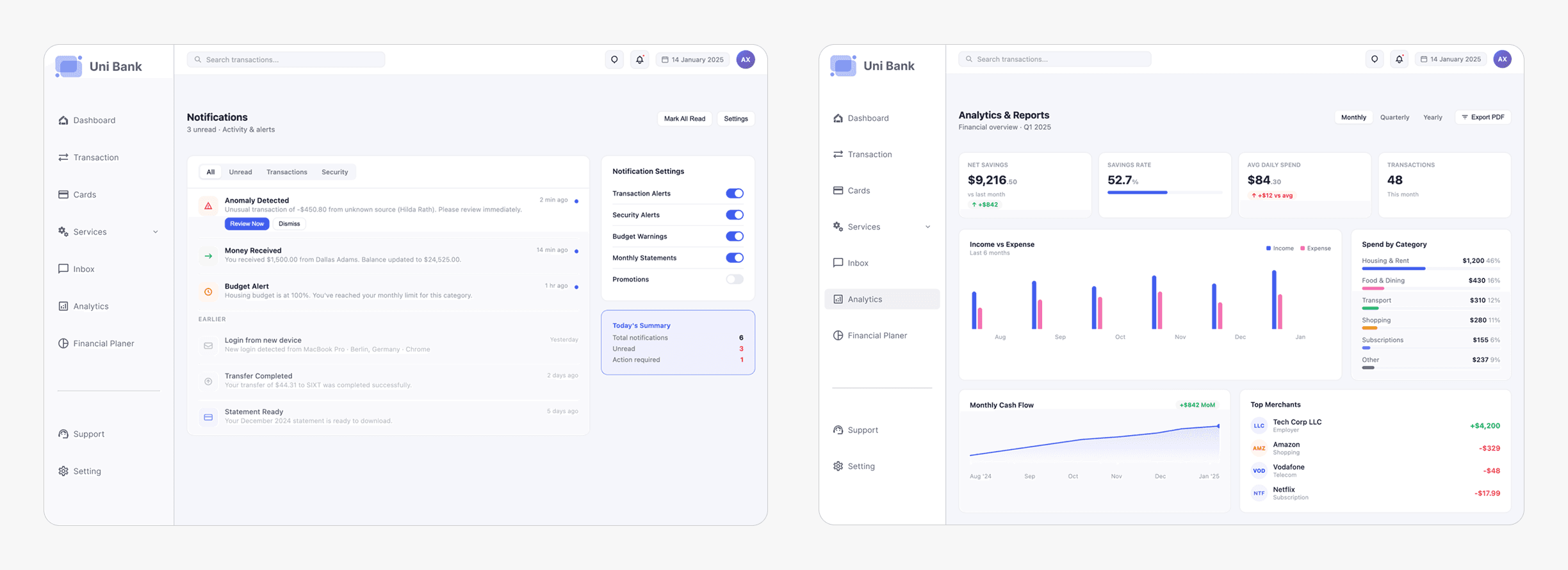
The layered layout solved this. KPI cards at the top answer the majority of questions before any chart is reached. Charts are sized as indicators they confirm a direction, they don't enable deep-dive analysis. Users who need more detail already know to go to the Transactions filter. The analytics screen earns its place by answering "how am I doing overall?" not by trying to be a financial reporting tool.
Outcome & Impact
The following figures are drawn from moderated usability testing with 8 participants across 3 sessions, benchmarked against the primary banking application each participant used before UniBank.
The quantitative results confirmed the design decisions. The qualitative feedback explained why they worked.
The most-cited moment across all eight sessions was the anomaly row treatment. Multiple participants used almost identical language: "it feels like the app is watching out for me." That's the outcome we designed toward not the visual, but the feeling it produced.
The second most-cited element was the balance prominence. Several participants noted that they understood their financial position before they'd consciously decided to look for it. That's the result of treating balance as the primary design element, not a supporting label.
The Financial Planner screen, added in week six using only existing components, went through zero design review cycles before it matched the visual quality of the screens that had been refined for weeks. That was the modularity system proving itself in practice.
Reflection
What we learned
The most important discipline in this project was holding the hierarchy work before the visual work. Two weeks in monochrome wireframes before any color was applied. It felt slow. It was the right call. Visual design is good at making things look like they're working. Wireframes surface whether they actually are.
The second lesson was more personal than methodological: trust is a design material in financial products. Every color choice, every word in a status label, every moment of friction or absence of friction carries emotional weight that goes beyond aesthetics. Users come to a banking app in a functional state of mind, but they leave in an emotional one. The anomaly treatment, the transfer confirmation screen, the budget warning colors, all of these had to be designed for how they'd feel, not just how they'd look.

